Monday, December 18, 2017

Semester Reflection


Projects

Name Typography

Our first project was a typography piece where we took an adjective of our name and created and searched for a font that matched the feel of our adjective. This project took us roughly two weeks to find create and mount our fonts and projects. Some challenges I faced were trying tome and be more creative than the original fonts. It was incredibly difficult coming back from summer break and having to open up my creativity again. I learned how to search more creatively and think outside the box of my original thoughts. Some of the feedback I received was mostly from my teacher, she pushed me to better myself and continue to think more creatively and to challenge myself. After my feedback I had to travel back into my fonts and search for more in depth meaning for the fonts and words we used. I throughly enjoyed this project, it was fun to come back from the break and to be pushed hard to better myself and my creativity.

Hand Written Typography Card

Our second project was a hand written greeting card. This project also took us another two weeks. Another one of the challenges I faced again in my font style, and I didn't extremely differ the font I was using. I was still trying to better myself in my font use and my font style, I used a different font style that matched my project. I just needed to work on differ my idea and font because that was the main idea on the project. The feedback I was given was from my teacher and my classmates, my classmates liked my idea and loved the roses, my teacher again pushed me to better myself and pushed my to become a better graphic artist. She wanted me to concentrate on the font style and the layout, she also helped me better place my roses into the font rather than next to it. I lived this project also, we had freedom to choose what we wanted to do and how we wanted to execute it. On top of that I got to show my love for roses in my project because it matched the cards feeling.


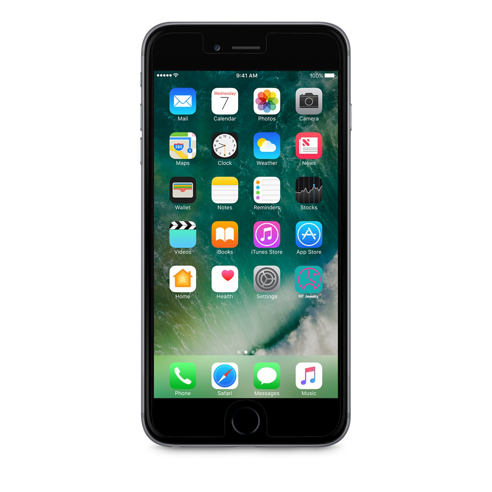
Fictional Branding A Company-NT Jewelry

Our final project was to make a fictional brand for a company. This project was inspired by 4 different things we were given, they were an animal, a number, two letters (mine being NT), and a mineral. This project took us three weeks. I faced a lot of challenges, in my past few years I have rarely touched photoshop. So when I had to lay out my logo onto my company store, or the merchandise. Even onto the uniform of my company it wasn't the easiest, I had to again edit my project to make sure these things when how I wanted them too. I learned a lot with photoshop and my layout process. I was given a little feedback on my process, it was mainly from those sitting next to me on little tips for the layout process and the designing. I only changed things when I asked them on how to do certain things. I enjoyed this project, I actually ended up going home and speaking with my mother and father about the project. 


Self Review

Time Usage

My time use in class i would consider very well spent except for my first few days, at the start of the semester i was watching YouTube, etc. in class, and it was a terrible use of time. However after that i felt like i devoted myself to my projects fully. Even if i felt like i was done, id always ask for advice or ways to better my work. If my classmates didn't have any advice then i went to my teacher, if nothing was there i continued to better my mock-ups and project presentation on behance this year. Outside of class this year i worked with a few in school projects for other classes or people that needed them. including helping a group in the video department of e-comm and helping h.y.p.e. with their open mic poster. 

Strengths and Weaknesses

I think that i have two major strengths and weaknesses as a graphic designer. My strength i think would be hand drawn projects, such as the roses, in which i had the ability to do what i wanted when i wanted to do it. However my major weakness would have to be finding the right font, i personally struggle with the understanding of font and weight in groups of text, however i'm working on it.
\

Summary

The thing i would have to say i loved most about this semester was finally getting to mount our final project after spending a lot of time on it. This semester i think i should've definitely spent my first few days in class more wisely and not trying to push the limits of what i could do. My over all learning from this semester would have to be my growth in all the areas from typography, to font choice, my improvement in Photoshop and scanning things in. My goal for next semester is to use my time more wisely and better myself on font choice. Overall i think this is the most fun ive ever had in a graphic design class ever. Ive defenitly learned more with my teacher than any other has ever taught me.

Wednesday, May 24, 2017

Animation Reflection

Valuable Takeaway From Animation Guarantees

Technology | 

I was slowly taught how to use my technology and programs This will follow me through the rest of my career Yes, Learning how to use this in my best way possible took me a long time with many many mistakes.

Collaboration |  

During the team projects or helping others around me. Person skills are something you will need for the rest of your life. no, I've been a people person all my life.

Communication |  

i didn't learn how to speak or communicate, I've done it since i could talk. communication will follow me through all of life. and its something i will need til the day i die. i never faced a challenge in communicating with others.

Project Management |  

I learned how to manage my projects using folders to hold each project or other folders to separate raw files from finished project, or based off of the application i was using. This is important because you will always need good management no matter what job or career you take. i never faced a challenge in managing my projects, I've always been a very organized person.

Leadership | 

i didn't have to learn anything about leadership, I've always been a good leader and naturally take lead. leadership makes a better person because leading isn't very easy, it takes a strong person to lead an entire crew or team. i never faced a challenge with leadership however, I've always been a leader in almost everything i do.

My Strengths or Weaknesses

I have improved mainly in my technology skills, i came into this class knowing almost nothing about molding or animation itself. However i still have a lot of places to better myself on my work ethic and work skills. With everything I've learned I'm going to take it into the real world for my future careers. How ever i wouldn't change anything about what I'm going to take into the world. 

The Year Overlook

My year has been extremely fun have enjoyed it all throughly. My relationships have been interesting that i have made, i have gotten many friends and created amazing bonds with my teachers. Roughly a week per project was needed for completion.

Tuesday, May 23, 2017

Semester Reflection

What Have I Done In Class?

11x17 poster

the 11x17 poster was okay, i didn't enjoy having to lookup everything on bauhaus but it was a interesting poster and history behind him and the school. i didn't get any feedback or change anything , i thought this was okay.

Typography 5x5

The typography 5x5 was 4 quote posters that i very throughly enjoyed. However i felt like my fellow students didn't use comment sense when explaining tips to me when giving me constructive criticism. I used color to separate words that weren't together, or even facing the wrong way. they still couldn't see that. i didn't change anything. i loved this project to death. 

Combination Mark Logo

The combination mark logo took us roughly a week, i Haven't found any challenges in this project. Along the way i have learned about how to successfully combine a logo and a word mark. i received feedback about my first and sixth logo, they were seen as my strongest two. i didn't change hardly anything. this was fun.

Business Card

The business card took us roughly a week, i had to move and change some of my information. Along the way i have learned about how to successfully make a business card using my logo and word mark. i received feedback about my information. i didn't change anything. this was interesting.

Letter Head

The letterhead took us roughly a week also, i Haven't found any challenges in this project. Along the way i have learned about how to successfully use my combined mark to creat a professional looking paper. i didn't change anything. I enjoyed this project.

Envelope

The envelope took us roughly a week, i Haven't found any challenges in this project. Along the way i have learned about how to successfully use my logo to create a professional looking envelope. i didn't change anything.

Time In Class

good. i continued to work and find ways to improve my work. i have worked with several actual clients outside of school to better myself. 

i have strengths in realizing fonts and color use.

my areas of improvement need to be that i don't allow myself to get distracted at easy.

summary

this semester i enjoyed the quote posters the most. i wouldn't change anything. i learned a lot, my personal goal next year is to better myself more. thank you.

Thursday, March 23, 2017

Marks/Symbols

What have i learned?

i knew most of this already since i had experience working with multiple clients before hand. However i have learned a few new things, i did not know that up and too the right was more appealing to the eye rather then down or too the left. One thing i have been doing yet never realizing it, is i have always been allowing the logo to breath and never trapping it.

Difference between symbol & a logo?

The difference between a symbol and a logo is that a symbol is something much smaller, that can be used multiple times and represents more than one area of interest. A logo is something that represents a company.

3 Facts I've learned

3 things I've learned is that almost any logo can be used as a copyrighted logo. There is intact a difference between a logo and a symbol. and that there are 6 different types of marks.

Favorite thing i have learned

that marks are sectioned into 6 different types of marks

general thoughts

i liked this presentation and I've throughly enjoyed learning about it.

Friday, March 10, 2017

4 posters

This quote was one of my grandfathers favorites before he passed. making this poster was a hard time for me because i had so many memories of him while i was creating it. I wanted to finish it however. So i devoted myself to it. he always told me to do my best, and good things will be achieved. Thats what this quote has came to do.


This next quote was my personal favorite. my goal in life was to and still is to do my best to succeed and progress in life. The gold represents the success and the white on black provides a cleaner look to the modern more successful side of things


This quote everyone can relate too, rough breakups often are remembers with song. losing a loved one, memories with song. Meeting your first crush, remembered with a song. If your  parent, meeting your significant other or having children, probably remember it with a song!


This quote is one by president John F Kennedy. This is one of his most famous quotes used inside a speech just a few weeks before being assassinated. It proves strong because he wanted everyone to get along enemies or not


Monday, January 30, 2017

11x17 Poster

How and Why

i chose the bauhaus because they way they express topics through shaped interests me and i wanted to try to embrace things in that manner. 

Research

I looked up past art work of bauhaus students and created a idea off of their designs

20 layout sketches

I just let me mind design everything and took no time waiting for ideas, i just let it happen

Creating

i chose a sketch and created it

Conclusion

this was fun and interesting

Friday, January 20, 2017

poster summary

Summary

The character and function of a poster

Posters are meant to show and attract the eye to a topic of c choice using arts or information of such, Along with showing points of government, communal, political situations, and solutions to problems. Connections between the producer and consumer are also important, it has to be of importance or have a visual appeal to bring a feeling of want among the consumer.

The laws of poster designing

A poster should grab the viewers attention, not like a paint brush on a easel but like a thief going through a window with a crowbar. it should grab the viewers attention in a matter of a second, very quick. Forcing the viewer to create a connection between the viewer and the poster.

General demands of poster design

legible, must arise interest and be innovative, max affect, large so its affective at a distance, should remain in the memory of the viewer.

Lettering in poster design

Where the lettering is placed changes all of the affect of the poster, it must have a good visual appeal and that forces the viewer to like the poster.

Shapes in poster designing

shapes should be clean and proper, overlapping shapes create a field of depth and perception changes.  This allows the poster to be more visually appealing and create a cleaner affect and appeal.

color in poster designing

color can decide the atmosphere, color can also give impressions of rhythm. Color is your main communicator  of feeling and vibes.

Three key points

color decides your feeling. Lettering decides the time your poster seems to be worth. Finally shapes creat your feeling of depth and cleanliness.

Favorite thing i read

color decides your feeling.

General thoughts + conclusions

interesting to read and give my input on.